In today’s modern world of fast-paced digital photography it’s easy to feel overwhelmed by the constant stream of new technology. Cameras, software and accessories are released at an alarming rate, and it’s easy to get caught up in the race to stay ahead of the curve. But it’s important to remember that first and foremost we are artists, and that technology serves the art and not the other way around. Don’t lose sight of the forest for the trees.
You can be sure Rembrandt didn’t lust over the latest brushes or Ansel Adams the latest developer or papers whenever their interpretation of light and shadow faced a challenge. Instead, they trusted their familiar tools even more to allow their hand and eye (the only lasting tools of the trade) to record the scene faithfully.
When you do upgrade your equipment (and we all do at some point) you owe it to yourself to thoroughly understand its features and functions. No one likes reading manuals, but it’s time well spent that you’ll appreciate the next time the light is fleeting and you’re focused on capturing the moment, not fumbling with dials or menu settings.
So purchase when you must, but don’t lose sight of the big picture. Put your energy into developing your vision and spend less time worrying about the march of progress. Art is about the seeing and no one will ever look at your images and say “that was made with a Nikon or Canon”. More likely, they will say “what was s/he feeling”!
The more comfortable you are with your equipment the more it becomes an extension of your mind’s eye and allows you the freedom to truly see the world around you. And that’s when your vision outshines all the other tools in your bag.
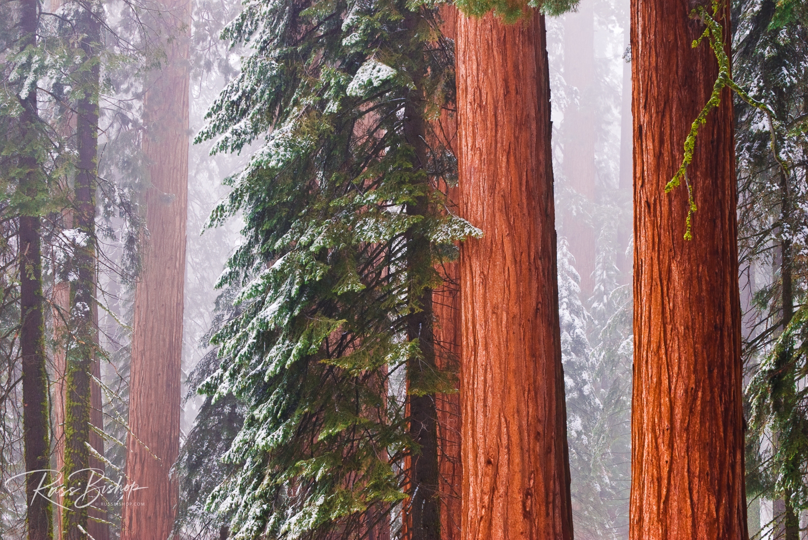
©Russ Bishop/All Rights Reserved