Beyond Technology – Creating Images with Heart

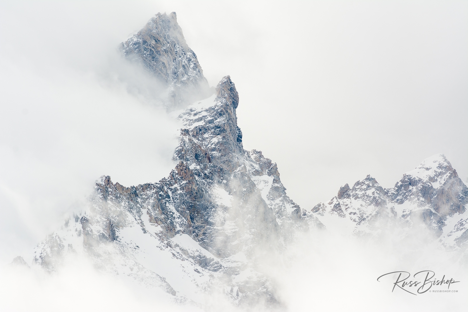
Beyond Technology - Creating Images with Heart. Cloud forest, Glacier National Park, Montana
Cloud forest, Glacier National Park, Montana

Beyond Technology – Creating Images with Heart

In today’s mobile world of social media and online everything we are exposed to more daily imagery than at any previous time in history. As a result, our visual sensitivity is developing at a rapid rate along with the need to mentally process these images in a timely manner.

Much the same way we have a hard time watching the dated animation from old sci-fi movies,  it’s easy to become more critical of what we like (and Like on Facebook). And with all of the various processing techniques (HDR, focus stacking, exposure blending to name a few) it’s also easy to be lulled into sensory overload from this highly polished visual world. But whatever technology may hold for the future, one thing will never change and that’s the need to create an emotional response with our images.

A technically perfect image may have the wow factor of a Hollywood blockbuster, but perfection does not necessarily create heart – and that’s really what photography is all about. Regardless of the subject matter, lens used or processing applied, convey the mood and emotion in your images through lighting, weather or technique and your photography will always rise above the crowd.

“Don’t shoot what it looks like. Shoot what it feels like.”   -David Alan Harvey


©Russ Bishop/All Rights Reserved

What You See Is What You Get

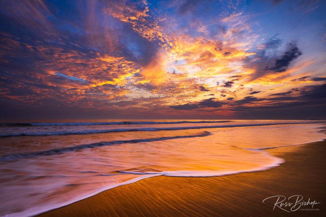
What You See Is What You Get. Sunset over the Channel Islands and Ventura Pier from San Buenaventura State Beach, Ventura, California
Sunset over the Channel Islands and Ventura Pier, Ventura, California

WYSIWYG (or “what you see is what you get”) is computer lingo for software that optimizes the screen display for a particular type of output. Back when word processing and desktop publishing software first hit the scene this was nothing short of a miracle. The software emulated the resolution of the printer in order to get as close as possible to WYSIWYG, but the main attraction was the ability to previsualize what you were producing prior to printing.

We now live in a far more advanced digital world of 4K monitors, massive image files, and the processors and video cards to handle them, but without color consistency across devices we might as well be living in the dark ages.

Monitor calibration has a reputation as being one of the great mysteries of digital imaging, but it really doesn’t have to be. Printing images that accurately represent what you see on-screen is a reasonable expectation that shouldn’t break the bank on wasted ink and paper. But unlike the out-of-box WYSIWYG experience you get when printing documents, your monitor requires a little assistance when it comes to images.

What you need is a spyder, and I’m not referring to those furry creatures lurking in your garage. Several companies sell highly accurate and reasonably priced kits like the Datacolor SpyderX Elite that include everything you need to guarantee that your output is consistent from screen to print. The spyder is actually a color sensor (called a colorimeter) that plugs into a standard USB port and works in tandem with software to read your monitor’s output. The process is known as calibration and it creates a custom profile that tunes your display to an industry reference standard, which is then used by image editing programs like Photoshop and Lightroom to provide consistent reliable color.

You trust your eyes and photo equipment when it comes to accurately representing your vision in the field, but it’s all for naught if your monitor doesn’t faithfully reproduce those tones and colors. Much like driving in the dark with your headlights off, editing images without a calibrated monitor is a guessing game. So before you buy another lens or camera body, don’t overlook one of the most important investments you can make as a digital photographer. A quality monitor and calibration kit may not be the most exciting gear you’ll buy, but they do guarantee that what you see is what you get.


©Russ Bishop/All Rights Reserved
Fall Color Photography – Where’s The Light?

Fresh snow on fall aspens and pines, Inyo National Forest, California USA

Fall Color Photography – Where’s The Light? Successful fall color photography obviously starts with planning around the seasonal changing of the leaves (and this Fall Color Map can help), but once you’ve scouted your location there’s another key factor to consider.

Where and how the color happens is dependent upon elevation and temperature and no two years are ever the same. The higher mountains of the west begin in mid-September, eastern hardwoods in October, and the lower red-rock country of the southwest typically in early November. Once you’ve settled on a destination and found that great grove of trees the next step is to understand the light.

It might seem like the vibrant reds or yellows before you would be faithfully reproduced by your sensor no matter what time of day, but understanding the quality of the light can go along way towards guaranteeing your success. Using backlight or sidelight when the sun is low on the horizon and illuminates the leaves from behind creates a wonderful warm glow, especially when set against a dark background.

Softlight is another great light source (illustrated above) that occurs when the sky is overcast and acts like a giant studio softbox. Under these conditions, it doesn’t matter what time of day you’re shooting as the shadows are eliminated and the uniform light both reduces the contrast while intensifying the colors.

So when the scene presents itself, consider the light and framing, and don’t be too quick to trip the shutter. A slight change in position or a little patience can often make the difference between a good image and a great one.


©Russ Bishop/All Rights Reserved