Visual Drama through Leading Lines

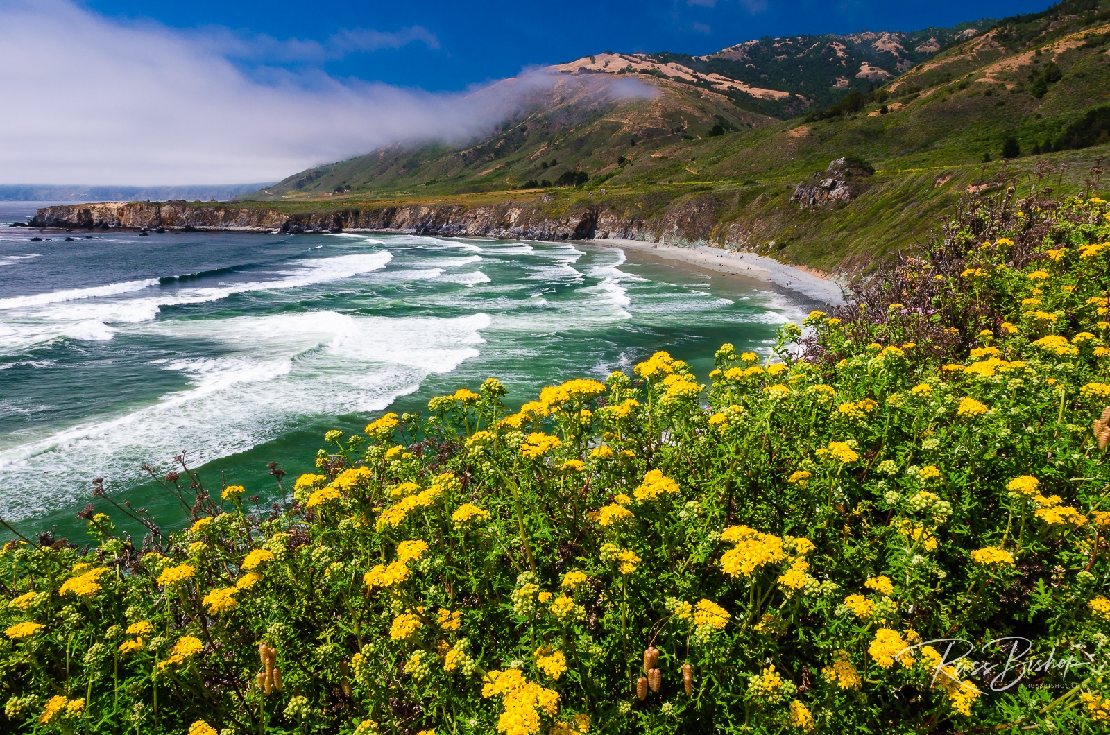
Visual Drama through Leading Lines. Wildflowers above Sand Dollar Beach, Los Padres National Forest, Big Sur, California
Wildflowers above Sand Dollar Beach, Los Padres National Forest, Big Sur, California

There are many ways to create stronger compositions in landscape photography, but one of the easiest and most effective techniques is the use of leading lines. Dynamic lighting and great subject matter are the desired cornerstones of any great composition, but even when these elements are less than exceptional there is still a way to create an emotional connection with your audience. Draw them into the scene with leading lines.

The wide-angle lens (anything 24mm and wider) has numerous benefits for the landscape photographer from incredible depth of field and relatively small size to a viewing angle that really captures the big picture. But all that visual information can be a bit overwhelming without some direction.

Using the rule of thirds and carefully composing to include natural lines such as a shoreline, forest edge, stream, or mountain ridge can lead your viewers into the frame or guide them to a specific part of the image. Diagonal lines in particular create visual tension, which is a sure-fire way to add drama to your images and create an emotional response with your audience.

Next time you’re out photographing the landscape, take a moment before you trip the shutter to make sure the elements within the frame are being used to their best advantage. Think of yourself as a director guiding your audience rather than just a photographer documenting the scene and you’ll be rewarded with stronger, more exciting images.


©Russ Bishop/All Rights Reserved

The Power of Negative Space

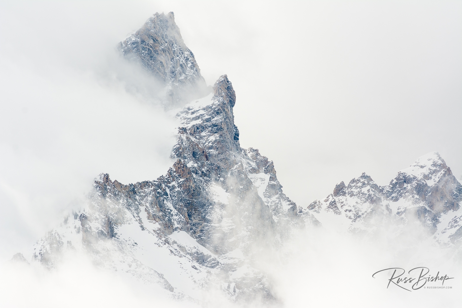
The Power of Negative Space. Clearing winter storm over Teewinot Mountain, Grand Teton National Park, Wyoming
Clearing winter storm over Teewinot Mountain, Grand Teton National Park, Wyoming

The Power of Negative Space. Successful landscape photography is often comprised of several elements coming together in harmonious balance within the frame. This can be quite complex or deceptively simple. Spatial relationships and color are the building blocks used to balance most compositions, and careful lens selection is essential in distilling an image down to its essence.

But sometimes less is more and an effective use of negative space can be a great tool to elicit an equally powerful response. This basic, but often overlooked principle of design, gives the eye a place to rest and increases the appeal of a composition through subtle means. The Japanese word ma is a perfect example. Roughly translated to “the space between two structural parts”, it is best described as a consciousness of place – the simultaneous awareness of form and non-form deriving from an intensification of vision.

The image above was made as a late winter storm was moving out of the Teton Range. By using a medium telephoto and focusing on the predominant white space I was able to isolate the spires and ridges to give the illusion that the mountains were floating in the clouds.

With the right conditions, adding negative space to your visual toolkit can be a simple yet powerful way to create strong images that resonate with your viewers.


©Russ Bishop/All Rights Reserved